|
|
|
|
|
|
|
|
|
|
|
|
|
|
|
|
|
|
|
|
|
|
|
|
|
|
|
|
2007 Solar Data Home Page
When you click on any of the buttons to the left you will see a day by day spreadsheet of each month's solar power generation. With each sheet you will be able to see the data in a graph format.
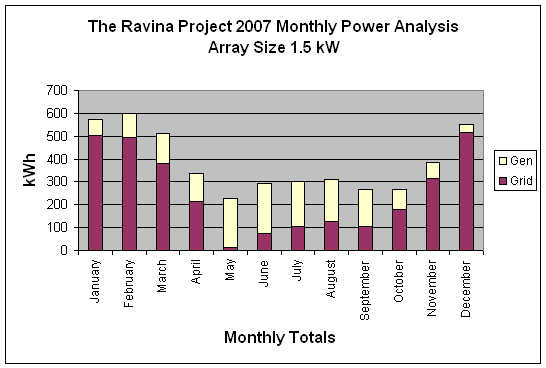
Note that the bar graphs illustrate the total power used by the house. The yellow part of the bar indicates the amount of power generated by the solar array.
Furthermore, if the bar descends below the bottom of the graph then for that day more power was produced than was used. The reading on our house meter will be less than the day before. This will occur in the summer time when we are not using air conditioning or the dehumidifier.
Below see the year to date at a glance. Gen means power generated by solar. Grid means power used from the grid. And % Gen is the electricity generated each month as a percent of the total monthly electrical power usage.
Some Statistics from the 2007 Data Base
Average Efficiency for year: 4.0 Wh/kW/min Maximum Efficiency for year: 8.6 Wh/kW/min Median Efficiency for year: 4.2 Wh/kW/min Std Deviation 2.2 Wh/kW/min Average Daily Generation: 4.4 kWh Maximum Daily Generation: 9.4 kWh Median Daily Generation: 4.4 kWh Std Deviation 2.8 kWh Kilowatt hours generated per kilowatt of installed base: 1068.9
Year 2007 Monthly kWh Analysis
| Month | Gen | Grid | % Gen | ||
| January | 69.9 | 505.2 | 12.2 | ||
| February | 107.7 | 493.1 | 17.9 | ||
| March | 134.7 | 378.6 | 26.2 | ||
| April | 123.4 | 214.1 | 36.6 | ||
| May | 215.4 | 12.4 | 94.6 | ||
| June | 218.9 | 72.8 | 75.0 | ||
| July | 193.2 | 106.9 | 64.4 | ||
| August | 182.4 | 128.4 | 58.7 | ||
| September | 161.9 | 106.0 | 60.4 | ||
| October | 87.8 | 180.5 | 32.7 | ||
| November | 70.5 | 314.0 | 18.3 | ||
| December | 37.6 | 515.0 | 6.8 | ||
| Total: | 1603.4 | 3027.0 | 34.6 |

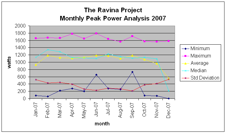
Year 2007 Monthly Peak Power Analysis
| Minimum | Maximum | Average | Median | Std Deviation | |||
| Jan-07 | 82 | 1652 | 936 | 1131 | 518 | ||
| Feb-07 | 60 | 1675 | 1181 | 1347 | 428 | ||
| Mar-07 | 220 | 1664 | 1128 | 1288 | 445 | ||
| Apr-07 | 279 | 1782 | 1112 | 1130 | 397 | ||
| May-07 | 202 | 1645 | 1134 | 1114 | 259 | ||
| Jun-07 | 653 | 1787 | 1183 | 1101 | 228 | ||
| Jul-07 | 274 | 1639 | 1178 | 1228 | 284 | ||
| Aug-07 | 251 | 1561 | 1102 | 1150 | 269 | ||
| Sep-07 | 727 | 1715 | 1182 | 1107 | 213 | ||
| Oct-07 | 87 | 1572 | 1079 | 1134 | 374 | ||
| Nov-07 | 76 | 1561 | 966 | 1089 | 415 | ||
| Dec-07 | 0 | 1578 | 557 | 208 | 526 |
